Fixing the Foundation: Ecommerce Design System-Driven UI Refactor
Overview
I led the design and rollout of a scalable design system at Avery, supporting two major transitions: unifying fragmented UI practices, and later enabling a full redesign during a tech shift to Tailwind CSS and Next.js. The system helped boost site performance by 54%, sped up implementation, and improved team collaboration.
The Problem & Opportunity
Avery’s UI was fragmented, with no shared design system, and workflows split across outdated tools like Photoshop and Sketch, developers lacked guidance, and handoffs were slow and error-prone. Later, when we identified a need to improve site performance, we saw a key opportunity to rebuild using modern frameworks—if design could meet development where they were headed.
Results & Impact
✅ 54% improvement in site performance after transition to Tailwind + design system components
✅ Resolved major accessibility issues, including WCAG 2.1 color contrast violations
✅ Fewer redundant design variants—reduced confusion in dev handoffs
✅ Clearer, faster component implementation—teams could focus on interaction nuance
✅ Better consistency across key ecommerce flows
🔧 Process & Execution
System Foundations
Tooling & Adoption
Governance & Collaboration
System Foundations
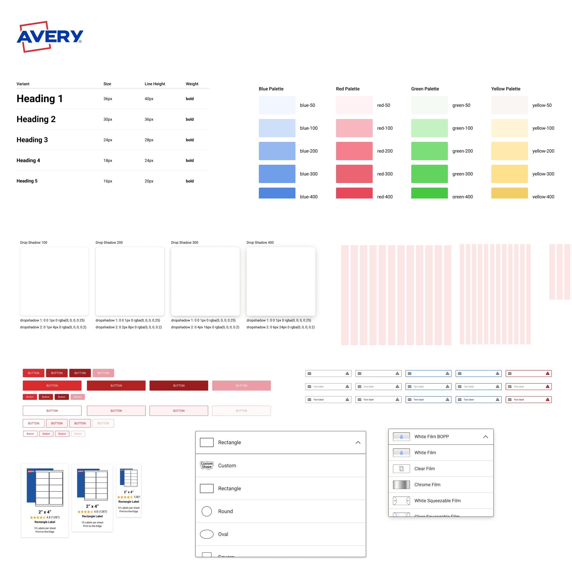
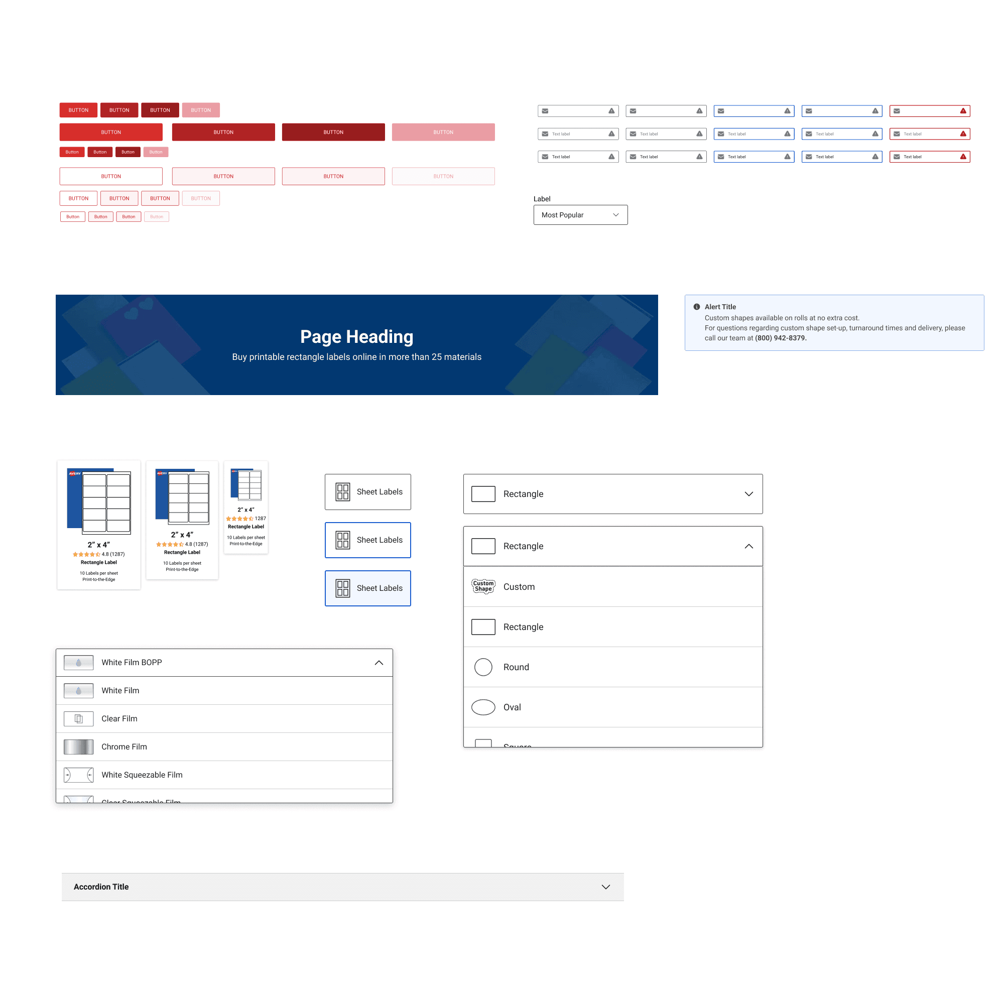
I applied atomic design principles to define:
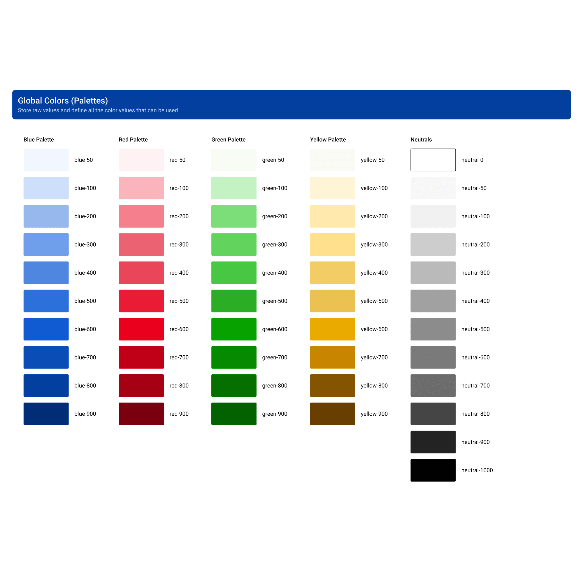
Color System: WCAG 2.1–compliant palette with semantic mapping
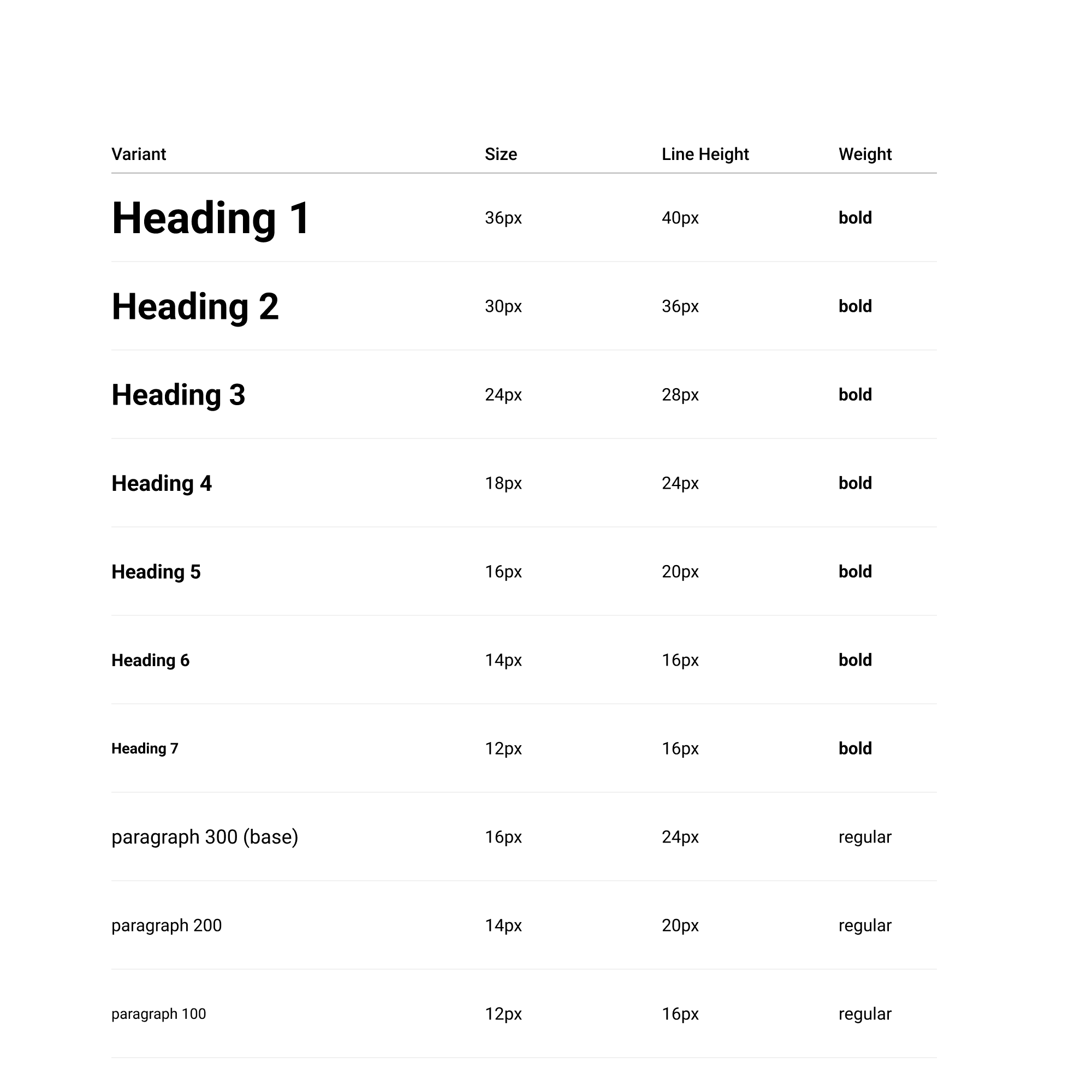
Typography: Modular scale with clear hierarchy
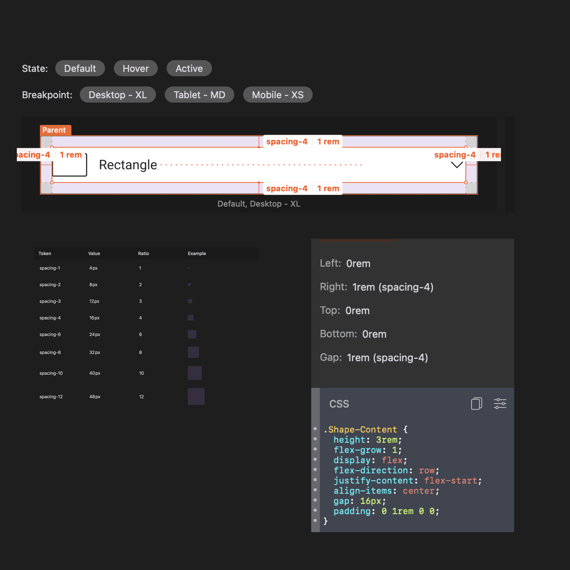
Spacing & Layout: Tokenized scale for responsive, consistent UI
Component Library: Modular, reusable components mapped to design tokens
Tooling & Adoption
Transitioned design from Sketch to Figma for modern collaboration
Used Zeplin for developer handoff and Storybook (for internal design tools) to document live React components
Organized live walkthroughs for the design and visual teams, and provided direct training to engineers and my junior design report
Created shared language across teams by aligning tokens in both design and code
Governance & Collaboration
Components were reviewed collaboratively to ensure proper token usage before inclusion in the system
Engineers praised the clarity and consistency—fewer questions, faster builds
The design system became the baseline for future page refactors and new product builds